For several years, the backdrop-filter “blur” has been available in all modern browsers. It allows the background of an HTML element to be blurred like frosted glass. This way, you can keep layouts color-neutral without them looking boring, and represent multiple layers in depth.
Today, we want to push the limits of this CSS feature and create a blur gradient. That is, a transition from blurred to sharp. This is not as simple to implement in CSS as one might initially assume. But it is possible.
By the end of this blog post, you will have a practical tool that will take your next website to a new level.
The Effect
This is how the blur gradient looks in action:

And here you can see it live: Codepen
How It’s Done
We will look at the whole thing using a fixed header, as shown above.
The HTML looks like this:
<header>
  <div class="content">
    ...
  </div>
</header>
<main>
  ...
</main>
And this is how we start with the styling:
:root {
  --header-height: 4rem;
}

header {
  height: var(--header-height);
  position: fixed;
  top: 0;
  left: 0;
  right: 0;
}

main {
  margin-top: var(--header-height);
}
The header is fixed, and the page content can scroll behind it. Currently, the header has no background, but we will change that shortly.
One might think that for such a blur gradient, you only need the backdrop-filter and a mask with a gradient.
Unfortunately, that’s not enough.
The problem is that a semi-transparent, very blurry background creates a “foggy window” effect.
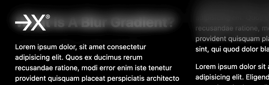
That is not what we want. We want a real transition from blurred to sharp.
To achieve the desired effect, we need multiple layers.
Each of these layers has a mask that creates a gradual transition from opaque to transparent. The first layer has a very light blur of 0.5px, the second of 1px, the third of 1.5px, and so on. This avoids the “foggy window” effect.
Let’s start with three layers. This is actually rather too few, but it’s enough for explanation.
We will hardcode the styles once to understand the principle and then write code that dynamically generates the styles.
We add the layers to the header in the form of divs with a class “background”:
<header>
  <div class="background"></div>
  <div class="background"></div>
  <div class="background"></div>
  <div class="content">
    ...
  </div>
</header>
In the CSS, we write:
header .background {
  position: absolute;
  top: 0;
  left: 0;
  right: 0;
  bottom: 0;
  z-index: -1;
}

header .background:nth-child(1) {
  backdrop-filter: blur(0.5px);
  mask-image: linear-gradient(to bottom, black 90%, transparent 100%);
}

header .background:nth-child(2) {
  backdrop-filter: blur(1px);
  mask-image: linear-gradient(to bottom, black 80%, transparent 90%);
}

header .background:nth-child(3) {
  backdrop-filter: blur(1.5px);
  mask-image: linear-gradient(to bottom, black 70%, transparent 80%);
}
Why 90% to 100% and 80% to 90%, etc.? Why not 0% to 100% for all layers?
We want the background of the header to be mostly blurred and then, in this case, become sharp over 30% of the height.
The first layer is opaque up to 90% and then becomes transparent up to 100%. The second layer is opaque up to 80% and then becomes transparent up to 90%. The third layer is opaque up to 70% and is transparent at 80%.
Each layer takes over part of the transition, and the blur adds up.
If you didn’t understand everything, that’s okay. We are now building a tool that will take the work and thinking off your hands. Of course, it’s still important to understand the principle to be able to adapt the code to your own wishes later.
Here, I would advise you to just play around a bit and change values to get a better understanding of the principle.
Dynamic Styles
I am actually a fan of pure CSS, but since there are (still) no loops there, we need SCSS. This is a preprocessor for CSS that you should know. If not, check out the documentation.
So we write the following in the SCSS file:
:root {
  --header-height: 8rem;
}

... /* other styles */

header .background {
  --gradient-height: 4rem;
  position: absolute;
  top: 0;
  left: 0;
  right: 0;
  bottom: 0;
  z-index: -1;

  $layerCount: 5;
  @for $i from 1 through $layerCount {
    &:nth-child(#{$i}) {
      backdrop-filter: blur(#{$i * .5}px);
      mask-image: linear-gradient(
        to bottom,
        black calc(100% - var(--gradient-height) / #{$layers} * #{$i}),
        transparent calc(100% - var(--gradient-height) / #{$layerCount} * #{$i - 1})
      );
    }
  }
}
To change the height of the gradient, you can adjust the variable --gradient-height. Depending on how high you want your header to be and how smooth you want the transition to be, you can vary accordingly.
We have increased the height of the header to 8rem because the transition alone should be 4rem high. Half of the header is therefore blurred, and from the middle to the bottom edge, the background becomes sharp.
With $layerCount, you can set the number of layers you use. The more layers, the stronger the blur effect.
Currently, the content of the header is as high as the header itself. However, it is advisable to make the content a bit smaller, as the header becomes too restless in the lower area due to the decreasing blur. About 70% has proven to be a good value.
header .content {
  height: 70%;
}
Finally, we can set a subtle gradient for the background to better highlight the content of the header.
header {
  ...
  background-image: linear-gradient(to bottom, rgba(0, 0, 0, .2), transparent);
}
Conclusion
So far, I have only seen blur gradients in Apple UIs and have always been fascinated by them. It is a subtle effect that presents an elegant alternative to hard borders.
If you have any questions, feel free to write to me!
You can find the complete code here: Codepen