Coding a modal is simple.
Coding a good modal is extremely labor-intensive:
- You need to create an element that displays content above the rest of the page
- You need to create a backdrop that visually pushes the rest of the page into the background
- You need to temporarily make all interactive elements that do not belong to the modal inactive (inert)
- You need to create one or more ways to close the modal by clicking/tapping
- The modal should also be closable with the keyboard (Escape)
- When the modal is closed, the focus should ideally return to the element that was focused before the modal was opened
- For aesthetic reasons, but also for UX reasons, you should implement a smooth opening and closing of the modal
What if I told you that it is now very easy to program a modal that meets all these requirements?
Without much JavaScript.
That would be amazing, I know.
And it actually works. In under 10 minutes!
We need a relatively new HTML element called “dialog”. Browser support is over 96%, so everything is cool. We now fill this element with any content.
<dialog>Hello Exord!</dialog>
The dialog element is invisible by default and can be opened as a modal via JavaScript.
const dialogElement = document.querySelector("dialog");

dialogElement.showModal();
Besides showModal(), there is also the function show(), which displays the content but not as a modal. Less interesting for us now.
In any case, the result should look like this:
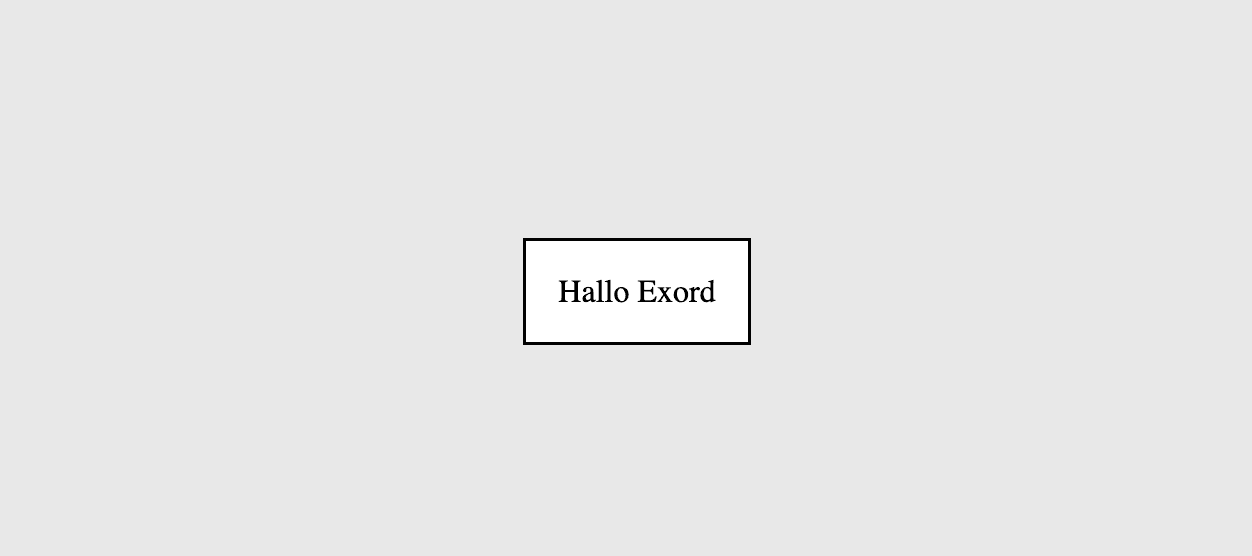
Let’s take a look at how we can style the modal, because it could look better!
dialog {
  border: none;
  border-radius: .5rem;
  box-shadow: 0 .25rem 1rem rgba(0, 0, 0, .1);
}
Three lines of CSS and the world looks completely different. A Z-index is unnecessary here, as the modal automatically appears on top. Practical.
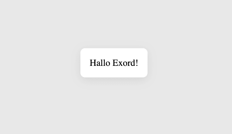
Closing with Escape already works. Try it out and be amazed!
Good, but we definitely need a button to close the window. To do this, we wrap the content of the dialog element in a form tag and specify “dialog” as the method. This means that the button within the form tag automatically closes the modal – without any JavaScript!
<dialog>
  <form method="dialog">
    Hello Exord
    <button>Ok</button>
  </form>
</dialog>
To display the content of the modal nicely in a column, we add in the CSS:
dialog {
  ...
}

dialog form {
  display: flex;
  flex-direction: column;
  gap: 1rem;
}
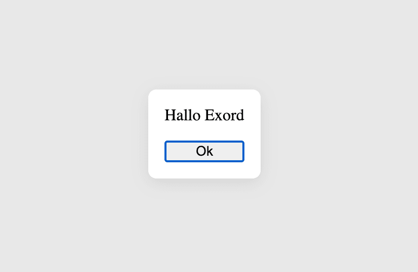
The great thing is that the button also gets focus directly and can be pressed with Enter. Accessibility is not only fair to those with disadvantages but also pleases people (like me) who simply like to work with the keyboard.
We now have a clean modal that meets the minimum requirements. The fact that it cannot be automatically closed with a click on the backdrop is still suboptimal, but we’ll fix that shortly.
Now it’s time for the smooth transitions, because it can be confusing when UI elements simply appear or disappear without being able to see where they come from or where they go.
Before we continue, let’s create a button that opens the modal so we can test better right away:
<button id="open_modal">Open Modal</button>
<dialog>
  <form method="dialog">
    Hello Exord
    <button>Ok</button>
  </form>
</dialog>
The JavaScript should then look like this:
const dialogElement = document.querySelector("dialog");
const openModalButton = document.querySelector("#open_modal");

openModalButton.onclick = () => dialogElement.showModal();
Important: it’s called showModal() and not openModal(). While the function for closing is called closeModal(). 💀
That’s just the way it is, we have to live with it.
Now for the animations. In fact, we only need to change the CSS for this, which doesn’t mean it’s easy. But still much simpler than implementing the whole thing with JavaScript.
dialog {
  border: none;
  border-radius: .5rem;
  box-shadow: 0 .25rem 1rem rgba(0, 0, 0, .1);
  opacity: 0;
  transform: scale(.95);
  transition: all .3s ease;
}

dialog form {
  ...
}

dialog[open] {
  opacity: 1;
  transform: scale(1);
}
We made the dialog element transparent, slightly scaled down, and gave it a transition. The crucial part is “allow-discrete”, a new CSS feature that allows transitions of display changes. Browser support is currently at 70%, but that will change soon. In the worst case, the modal simply won’t be animated, but it will still work.
We style the open dialog element so that it is not transparent and not scaled.
Now we can adjust the backdrop in a similar way to create a smooth transition here as well:
dialog {
  ...
}

dialog::backdrop {
  opacity: 0;
  transition: all .3s ease;
}

dialog form {
  ...
}

dialog[open] {
  ...
}

dialog[open]::backdrop {
  opacity: 1;
}
Now we have only one problem: The modal closes smoothly, but opens without transition. So far, we have only defined the end state of the closed modal and the end state of the open modal. We now need to define the starting state of the open modal:
dialog {
  ...
}

dialog::backdrop {
  ...
}

dialog form {
  ...
}

dialog[open] {
  ...
}

dialog[open]::backdrop {
  ...
}

@keyframes starting-style {
  from {
    transform: scale(.9);
    opacity: 0;
  }
  to {
    transform: scale(1);
    opacity: 1;
  }
}

dialog[open] {
  animation: starting-style .3s ease;
}
Now everything should work!
If it doesn’t work for you, it may be due to the order of the CSS rules. It is important that the @keyframes rule comes after the others. Otherwise, it’s the browser’s fault.
Close on Backdrop Click
The last thing we can do to perfect our modal is to enable closing the modal by clicking on the backdrop. This is not strictly necessary, but a feature that many users expect.
Unfortunately, I only found a “hacky” solution for this. Until there is a native solution, it is good enough.
The key is to set the padding of the dialog element to 0 and instead give the form element the padding. Then we can add this to the JavaScript:
window.addEventListener("click", event => {
  if (event.target === dialogElement) dialogElement.close();
});
You can find the entire code here: Codepen
Oh, the buttons should still be styled. Feel free to take care of that! ✌️